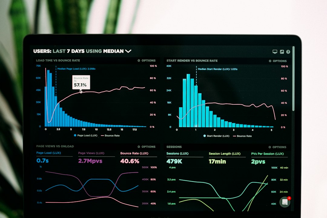

Google shifted to mobile-first indexing several years ago, yet many websites still struggle with optimization gaps between their desktop and mobile versions. If your desktop site ranks well while your mobile traffic lags, you likely have hidden technical flaws dragging down your organic performance. A thorough mobile first SEO audit identifies these vulnerabilities, ensuring search engine crawlers and smartphone users experience a fast, accessible, and fully functional website.
Conducting this audit requires looking beyond simple responsive design. You must evaluate core vitals, resource blocking, viewport configurations, and touch target sizes. This guide breaks down the exact workflow needed to audit your mobile SEO health and fix critical performance bottlenecks.
Understanding Mobile-First Indexing Fundamentals
Mobile-first indexing means Google predominantly uses the mobile version of your content for indexing and ranking. Historically, the desktop version served as the primary baseline. Today, if your mobile site lacks essential content, internal links, or structured data present on desktop, your overall search visibility will suffer.
To maintain parity, ensure your mobile site contains the exact same high-quality text, images, videos, and metadata as your desktop version. Hidden content behind accordions or tabs is generally indexed now, but it must be easily discoverable and accessible without requiring complex user interactions that frustrate mobile visitors.
Core Technical Checks for Mobile SEO
Technical performance heavily influences mobile rankings. Smartphone users demand speed, and search engines penalize slow-loading, frustrating layouts. Your audit should immediately target these core technical elements:
- Viewport Configuration: Verify that your pages include the correct viewport meta tag () to scale content correctly across varying screen sizes.
- Resource Accessibility: Ensure Googlebot can crawl CSS, JavaScript, and images. Blocking these assets via robots.txt prevents search engines from rendering your mobile layout properly.
- Core Web Vitals: Analyze Largest Contentful Paint (LCP), Interaction to Next Paint (INP), and Cumulative Layout Shift (CLS) specifically on mobile devices using real-user data from the Chrome User Experience Report.
- Touch Target Spacing: Buttons and links must feature adequate padding and spacing to prevent accidental misclicks on smaller touchscreens.
Content and Usability Evaluation
Technical soundness alone will not secure top rankings. User experience metrics heavily influence behavioral signals that search algorithms monitor. Evaluate how your content reads and functions on mobile screens by testing directly on physical devices rather than relying solely on browser emulators.
Check font sizes to ensure body text renders at a minimum of 16px without requiring users to pinch and zoom. Additionally, eliminate intrusive interstitials like full-screen pop-ups that block the main content immediately upon arrival, as Google explicitly penalizes these disruptive patterns on mobile search results pages.
Mobile First SEO Audit Comparison
Different auditing tools serve distinct functions during a comprehensive mobile review. Choosing the right tool helps prioritize fixes efficiently.
| Tool | Primary Function | Лучше всего использовать для | Ограничение |
|---|---|---|---|
| Google Search Console | Index coverage & mobile usability | Identifying crawl errors and reported usability issues | Data can sometimes be delayed by a few days |
| PageSpeed Insights | Core Web Vitals & performance | Analyzing field and lab performance metrics | Scores fluctuate based on network conditions |
| Mobile-First Indexing Checker | Content parity verification | Comparing HTML elements between desktop and mobile | May require manual verification for complex dynamic content |
Советы экспертов
- Test your mobile site on lower-end budget smartphones to experience real-world latency and processing limitations.
- Never lazy-load critical above-the-fold images or primary text content, as this delays your Largest Contentful Paint metric.
- Keep URL structures identical across desktop and mobile versions to avoid fragmented link equity.
- Monitor your mobile conversion rate alongside traffic metrics to ensure usability improvements directly drive business goals.
Распространенные ошибки, которых следует избегать
- Using separate mobile URLs (m.domain.com) without implementing correct canonical and alternate tags.
- Blocking important JavaScript or CSS files in your robots.txt file.
- Serving compressed images that still exceed reasonable file sizes for mobile data networks.
- Ignoring mobile-specific structured data errors that prevent rich snippet display.
Часто задаваемые вопросы
What is mobile-first indexing?
Mobile-first indexing means that Google predominantly uses the mobile version of a website’s content for indexing and ranking purposes. If your site has a responsive design, the content is identical across devices, but separate mobile URLs require careful parity checks.
How do I check if my site is mobile-friendly?
You can use Google Search Console’s Mobile Usability report or the PageSpeed Insights tool. These platforms highlight specific rendering issues, touch target spacing problems, and viewport configuration errors that need immediate remediation.
Does mobile-first indexing affect my desktop rankings?
Yes. Because Google maintains a single index, the mobile version of your content serves as the baseline for all search results. Poor mobile optimization can drag down rankings even on desktop searches.
Why are my Core Web Vitals failing on mobile?
Mobile failures usually stem from heavy JavaScript execution, unoptimized images, render-blocking resources, or third-party scripts loading slowly on constrained smartphone hardware and slower cellular networks.
Should I use a separate mobile URL structure?
Generally, no. Responsive web design using a single URL with CSS media queries is strongly recommended by search engines because it simplifies maintenance and prevents URL fragmentation issues.
How does font size impact mobile SEO?
Tiny fonts force users to pinch and zoom, creating a poor user experience. Google tracks these behavioral signals, and difficult-to-read mobile pages often struggle to maintain competitive organic rankings.
Are pop-ups penalized on mobile searches?
Intrusive interstitials and full-screen pop-ups that cover the main content immediately after a user arrives from a search results page can trigger algorithmic penalties and negatively impact your mobile visibility.
How often should I conduct a mobile SEO audit?
You should perform a comprehensive mobile SEO audit at least twice a year, or immediately following any major website redesign, CMS migration, or significant layout updates.
Заключение
A comprehensive mobile first SEO audit ensures your website meets modern technical standards while delivering an exceptional user experience to smartphone visitors. By resolving parity gaps, optimizing Core Web Vitals, and eliminating usability roadblocks, you protect your organic search visibility and capture valuable mobile traffic. Start by checking your Search Console reports today and systematically address any reported mobile usability warnings.
Ready to improve your search visibility? Explore our other technical SEO guides to further refine your organic growth strategy.